Summary
Highlight Key Metrics: Focus on revenue growth, customer acquisition rates, and user engagement to demonstrate startup traction.
[01]
Use Visuals: Employ clear charts and graphs to make data easily digestible for investors.
[02]
Tell a Story: Connect your metrics to a narrative that illustrates your startup's journey and market validation.
[03]
Be Transparent: Provide context for your data, explaining what each metric means and its significance.
[04]
Align with Strategy: Ensure your traction slide reflects your business model and market strategy to show cohesive planning.
[05]
When you're building your investor pitch deck, the pitch deck traction slide is where the magic happens. It's your chance to show investors that your startup isn't just an idea scribbled on a napkin—it's a living, breathing business that's gaining real momentum. This slide showcases your startup traction metrics like revenue growth, user engagement, and those key partnerships that make you stand out in a crowded market.
But let's be honest—it's not just about tossing numbers onto a slide. It's about weaving a story. Remember when your Monthly Active Users (MAU) doubled in just six months? Or when landing that big client took your revenue to new heights? These aren't just stats; they're proof that your business model works and that you're not just dreaming—you’re doing.
When it comes to traction slide design, keep it visual and straightforward. Think of those traction slide examples that grabbed your attention: clean layouts, compelling graphics, and a laser focus on what matters. Skip the fluff and let your metrics do the talking.
By nailing your traction slide, you're building credibility with investors. You're not just showing growth metrics for startups; you're demonstrating market demand and showcasing the evidence of traction that investors are hungry for.
Key Takeaways:
Use traction in pitch decks to highlight measurable growth.
Make the data visual and impactful.
Build trust by showcasing clear progress and market validation.
Understanding the Importance of a Traction Slide
So, why is the traction slide such a big deal in your investor pitch deck? Well, it's like the proof in the pudding. It's where you move from "Here's my cool idea" to "Here's my business that's actually taking off." Including a traction slide is essential for showing investors that your startup has legs.
Startup traction metrics are the heartbeat of your business. They’re the key performance indicators for startups that investors scrutinize to see if you’ve got what it takes. Metrics like revenue growth, customer acquisition rate, and engagement stats such as MAU and Daily Active Users (DAU) are your golden tickets. They’re not just numbers; they’re stories of your success.

Think about it: Investors are taking a risk on you. They need to see the evidence of traction to feel confident. A well-crafted business traction slide demonstrates that there's real market demand for what you're offering. It shows that you've moved beyond the idea stage and are now in the realm of execution and growth.
Moreover, presenting these figures effectively reflects on your credibility. According to CB Insights, one of the top reasons startups fail is due to a lack of market need. Your traction slide proves that the market not only needs but wants what you're selling.
At the end of the day, a solid traction slide doesn't just validate your business model—it paves the way for future growth. It tells investors, "We're not just surviving; we're thriving, and here's the proof."
Key Metrics to Showcase in Your Traction Slide
Alright, let's dive into the nitty-gritty. What startup traction metrics should you spotlight on your traction slide? Picking the right ones is like choosing the best ingredients for a recipe—they make all the difference.
Revenue Growth
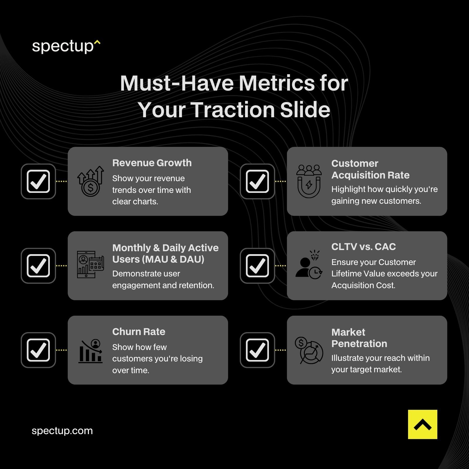
Think of revenue growth as the pulse of your startup. Investors love seeing those numbers climb. If you've got a chart showing steady or explosive revenue increases, slap that on your slide. For instance, doubling your revenue year-over-year isn't just impressive; it's a signal that your business model is hitting the mark.
Customer Acquisition Rate
Your customer acquisition rate tells investors how quickly you're bringing in new customers. It's a direct reflection of your marketing effectiveness and product appeal. If you've found a cost-effective way to acquire customers, that's music to an investor's ears.
Monthly and Daily Active Users
For those in the tech or app space, MAU and DAU are crucial. They show not just that people are signing up, but that they're sticking around and engaging with your product. A growing number of active users can indicate a strong product-market fit.
CLTV and CAC
Balancing Customer Lifetime Value (CLTV) with Customer Acquisition Cost (CAC) is key. Investors look for a healthy ratio here—ideally, your CLTV is at least three times your CAC. This means you're not just acquiring customers; you're making money from them in the long run.
Churn Rate
No one likes a leaky bucket. Your churn rate measures how many customers you're losing over time. A low churn rate suggests that users love your product and are sticking around, which is a big plus.
Market Penetration
How much of your target market have you captured? Showing market penetration metrics can demonstrate both your current success and your scalability potential. If you're already making waves in a small segment, imagine what you could do with more resources.
By carefully selecting and showcasing these key performance indicators for startups, you're painting a picture of a thriving business that's ready to scale. Each metric is a piece of the puzzle, and together they show investors that you're not just hopeful—you’re the real deal.
Best Practices for Creating an Effective Traction Slide
Now that you've got your metrics lined up, how do you present them without putting your audience to sleep? Crafting an effective traction slide is part art, part science. Here are some traction slide best practices to make your slide stand out.
Keep It Simple and Focused
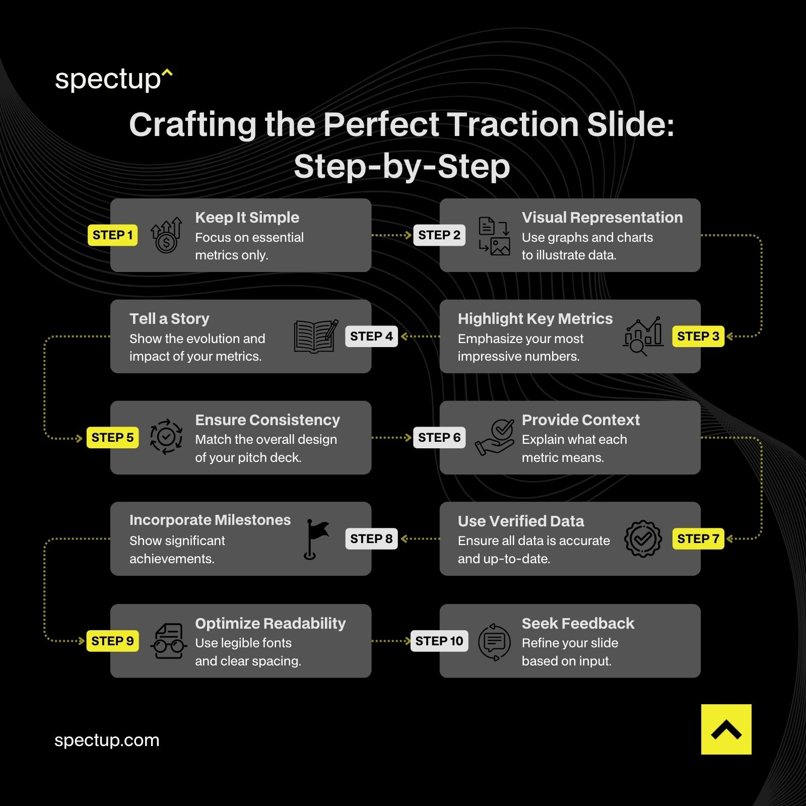
Less is more. Seriously. Stick to the most impactful metrics that tell your growth story. Overloading the slide with data can confuse or overwhelm investors. Focus on quality over quantity.
Use Visual Representation of Data
A picture is worth a thousand numbers. Use graphs, charts, or infographics to make your data pop. Visuals not only make your slide more engaging but also help investors grasp your progress at a glance. Think about visualizing growth in pitch decks with clear, simple visuals.
Highlight Key Metrics
Make sure your most impressive numbers are front and center. If your customer acquisition rate has skyrocketed, let it shine. Use bold fonts or colors to draw attention to these standout stats.
Tell a Story with Your Data
Remember, it's not just about numbers—it's about the narrative. Show how your metrics have evolved over time. Did a pivot lead to increased user engagement? Did a new marketing strategy boost revenue? Connecting the dots helps investors see the journey.
Ensure Consistency with Your Pitch Deck
Your traction slide should match the overall look and feel of your pitch deck. Consistency in design—from fonts to color schemes—adds a layer of professionalism and makes your presentation cohesive.
Provide Context for Your Metrics
Numbers without context can be meaningless. Briefly explain what each metric means and why it's important. If your DAU spiked after launching a new feature, mention that. This adds depth to your data.
Use Real-Time and Verified Data
Honesty is the best policy. Ensure your data is up-to-date and accurate. Inflated or outdated numbers can backfire and damage your credibility with investors.
Incorporate Milestones and Achievements
Don't forget to include significant milestones. Whether it's reaching 10,000 users or launching in a new market, these achievements show progress beyond the numbers.
Optimize for Readability
Make sure everything on your slide is easy to read. Use legible fonts and adequate spacing. An overcrowded slide can be a real turn-off.
Seek Feedback and Iterate
Before the big pitch, run your traction slide by mentors or colleagues. They might spot areas for improvement that you missed. It's all about refining your presentation.
By following these best practices for traction slides, you're setting yourself up for success. An effective traction slide is more than just a collection of numbers—it's a compelling snapshot of your startup's journey and potential.
How to Show Traction to Investors Effectively
Alright, you've got the metrics and the design down. But how do you present your traction in a way that makes investors sit up and take notice? Here are some investor presentation tips to make your traction slide unforgettable.
Craft a Narrative Around Your Metrics
People love stories. Use your metrics to tell one. For example, explain how a targeted marketing campaign led to a 50% increase in Monthly Active Users (MAU). This not only shows growth but also your ability to execute effective strategies.
Highlight Milestones and Achievements
Did you recently secure a major client or hit a revenue milestone? Shout it from the rooftops. These accomplishments serve as proof points that you're moving in the right direction.
Use Visual Aids to Enhance Understanding
We've talked about this before, but it bears repeating. Visuals like charts and graphs make complex data digestible. Make sure they're clear, professional, and aligned with your overall pitch deck structure.

Provide Comparative Analysis
Show how you stack up against the competition. If your customer acquisition rate is better than industry averages, highlight that. It underscores your unique value proposition and market position.
Showcase Customer Success Stories
Including brief customer testimonials or case studies can add a human touch. It shows that real people are benefiting from your product or service, which can be incredibly persuasive.
Emphasize Future Growth Potential
While your current traction is important, investors are also betting on your future. Outline how you plan to build on your momentum. Whether it's expanding into new markets or launching additional features, show that you have a roadmap for continued success.
Maintain Transparency and Honesty
This can't be overstated. Be upfront about challenges and how you're addressing them. Investors appreciate honesty and are more likely to trust you if you're transparent.
By effectively showcasing traction in your pitch deck traction slide, you're doing more than just presenting numbers—you're building an emotional connection with your audience. You're showing investors not just where you are, but where you're headed and why you're the team to get there.
Enhancing your pitch deck traction slide is crucial for attracting investors. Spectup specializes in creating compelling presentations that effectively highlight your startup's strengths and traction, ensuring every slide resonates with investors and emphasizes your growth potential.
Examples and Case Studies of Successful Traction Slides
Sometimes, seeing is believing. Let's dive into some traction slide examples from startups that knocked it out of the park. By analyzing successful pitch decks, we can pick up tips and tricks to make our own slides shine.
Airbnb's Early Traction
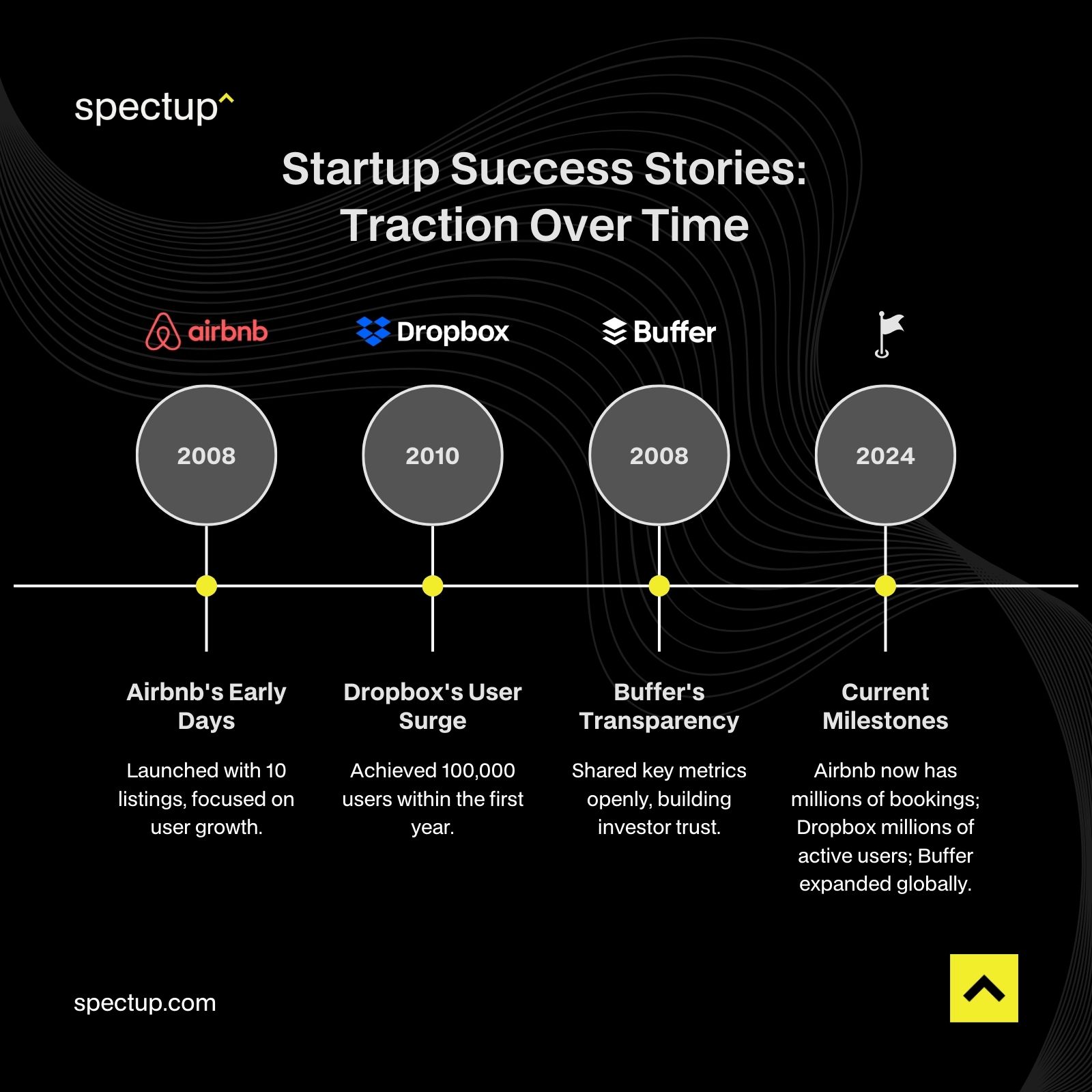
Back when Airbnb was just a scrappy startup, their pitch deck included a traction slide that was simple yet powerful. They showcased their growth metrics with clear charts, highlighting their increasing number of users and bookings. The slide wasn't cluttered—it told a story of steady growth, which was compelling for investors.
Dropbox's User Growth
Dropbox focused on their skyrocketing user numbers in their traction slide. They presented a straightforward graph showing a steep upward trajectory in user adoption. This visual representation of data made it easy for investors to grasp their market demand demonstration.
Buffer's Transparency
Buffer took a unique approach by sharing not just their successes but also their challenges. They included their key performance indicators for startups, such as revenue, expenses, and even employee salaries. This level of transparency built trust and showed investors they had nothing to hide.
Lessons Learned
What do these examples teach us?
Keep it Simple: Don't overload your slide. Focus on the most compelling data.
Tell a Story: Use your metrics to weave a narrative about your growth.
Be Honest: Transparency builds credibility with investors.
Visual Appeal: Use clean designs and charts to make your data pop.
By learning about traction slides in pitch decks from these success stories, you can avoid reinventing the wheel. Instead, adapt what works and make it your own.
Common Mistakes to Avoid in Traction Slides
Even the best of us can stumble. When creating your traction slide, there are some common pitfalls that can trip you up. Let's avoid common pitfalls in traction slides by shining a light on them.
Overloading with Data
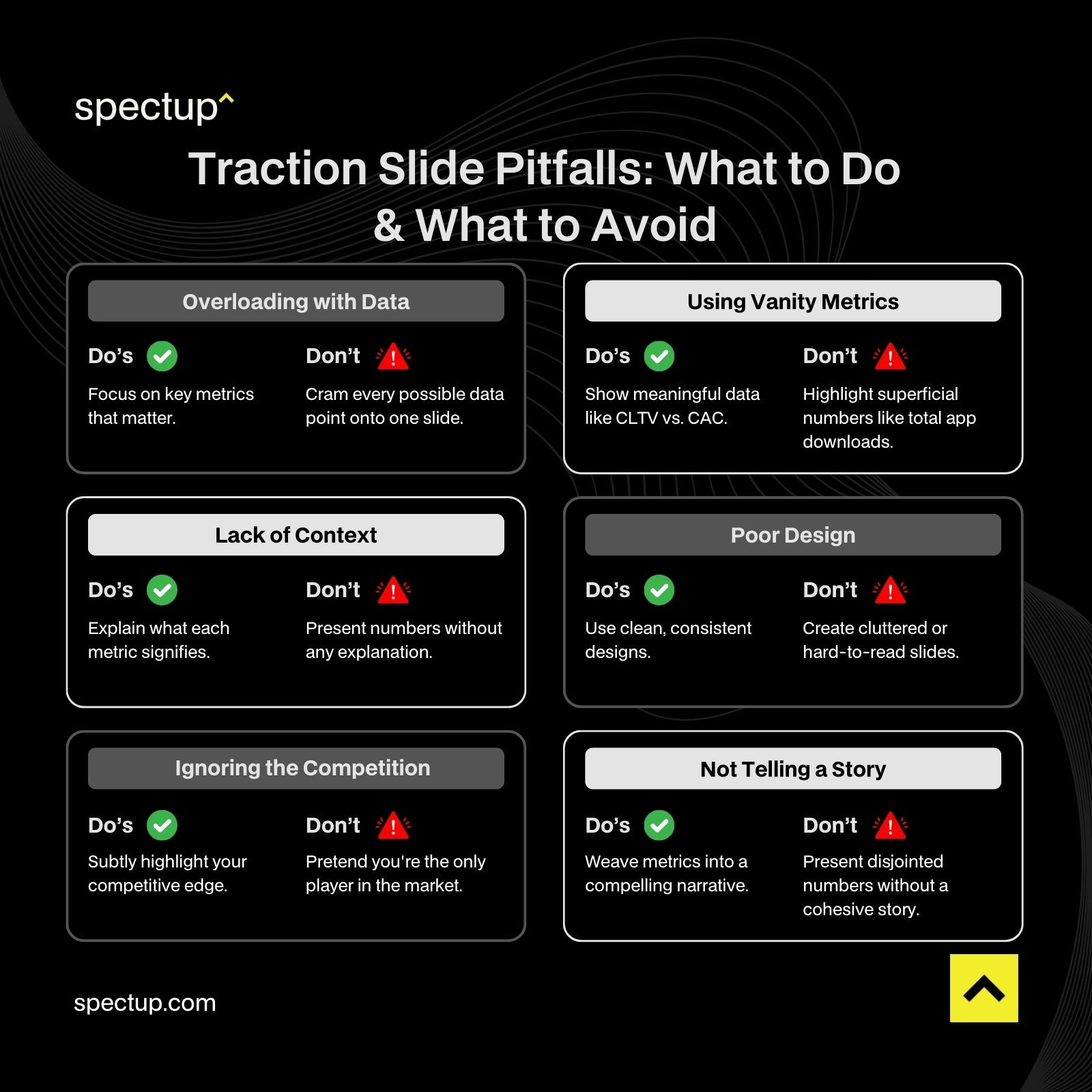
We've all been there—thinking that more data equals more credibility. But cramming too much info onto one slide can overwhelm and confuse your audience. Stick to the key metrics that matter most.
Using Vanity Metrics
Sure, big numbers look impressive, but do they actually mean anything? Metrics like total app downloads or website hits might not reflect true user engagement or revenue. Focus on meaningful data that shows real market validation.
Lack of Context
Throwing numbers at investors without context is like giving someone pieces of a puzzle without the picture on the box. Explain what your metrics mean and why they matter.
Poor Design
A cluttered or unprofessional slide can distract from your message. Pay attention to your traction slide design—keep it clean, use consistent fonts, and make sure everything is readable.
Ignoring the Competition
Investors know you're not operating in a vacuum. Failing to address your competitors can make you seem naive. Use your traction slide to subtly highlight how you're outperforming others in your space.
Not Telling a Story
Numbers are important, but without a narrative, they can fall flat. Weave your metrics into a story that highlights your journey, challenges overcome, and milestones achieved.
By avoiding these common mistakes in traction slides, you set yourself up for a presentation that resonates with investors and keeps them engaged.
Aligning Traction with Your Business Model and Market Strategy
Alright, let's talk strategy. Your traction slide shouldn't exist in isolation—it needs to tie back to your overall business model and go-to-market strategy.
Reflect Your Business Model
If you're a subscription-based service, emphasize metrics like Monthly Recurring Revenue (MRR) or customer retention rates. For a marketplace, you might focus on the number of active buyers and sellers. The key is to showcase traction that directly supports how you make money.
Showcase Market Validation Strategies
Demonstrate how your traction proves there's a real need for your product. Are you solving a problem that's been overlooked? Use your metrics to show how your solution slide addresses the pain points highlighted in your problem slide.
Highlight Your MVP Success
Your Minimum Viable Product (MVP) is your initial step into the market. If your traction shows that users love your MVP, that's a strong indicator of future success. Investors will see that you've validated your idea with real users.
Address Market Size and Potential
Use your traction to show how you're capturing a portion of a large and growing market size. If you're in a niche like AgeTech, demonstrate how your early traction positions you to dominate that space.
Tie into Your Go-To-Market Strategy
Show how your traction is a result of your strategic efforts. Did a particular marketing campaign boost your customer acquisition rate? Explain how your efforts are paying off and how you plan to scale them.
By aligning traction with your business model and market strategy, you present a cohesive story that shows investors you're not just hitting numbers randomly—you're executing a well-thought-out plan.
Scaling Your Startup: Leveraging Traction for Growth
You've got traction—now what? It's time to think about scaling your startup. Investors want to see that you have a plan to turn early successes into long-term growth.
Demonstrate Scalability Potential
Use your traction to illustrate how your business can grow. If your customer acquisition costs are decreasing while your customer lifetime value is increasing, that's a strong signal you can scale efficiently.
Outline Your Growth Strategy
Are you planning to expand into new markets? Launch new products? Hire key team members? Share your roadmap and how your current traction supports these plans.
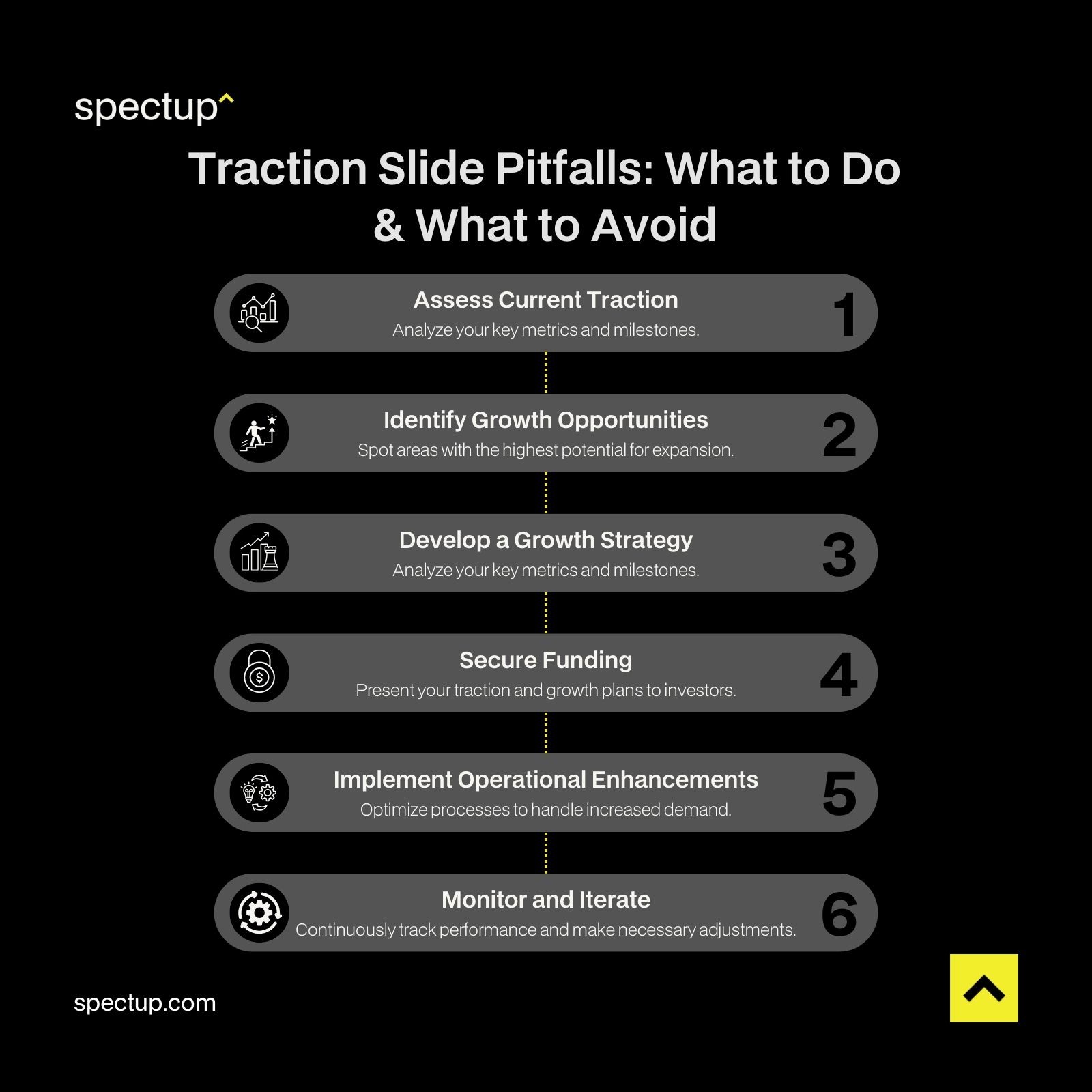
Traction Slide Pitfalls
Highlight Funding Needs
Be clear about how additional funding will help you scale. Investors appreciate knowing exactly where their money will go and how it will accelerate your growth.
Showcase Operational Readiness
Scaling isn't just about selling more—it's about being able to handle more. Discuss how your operations, technology, and team are prepared to manage increased demand.
Use Case Studies
Include case studies for traction slides that show how other startups have successfully scaled after reaching a similar point. This can help investors visualize your potential path forward.
By leveraging your traction to demonstrate scalability, you're showing investors that you're not just a flash in the pan—you have the foundation to become a significant player in your market. Spectup offers expert consulting in financial modeling and strategic planning to drive sustainable growth, optimize strategies, and strengthen investor pitches.
Incorporating Customer Testimonials and Milestones
People connect with people. Including customer testimonials and highlighting key milestones can add a personal touch to your traction slide.
Customer Testimonials
A heartfelt quote from a satisfied customer can speak volumes. It shows that real people are benefiting from your product or service. Just make sure the testimonial is genuine and relevant.
Highlight Major Milestones
Have you reached 10,000 users? Secured a patent? Won an industry award? These milestones are worth showcasing. They provide tangible evidence that you're making significant progress.
Show Social Proof
Including logos of well-known clients or partners can boost your credibility. It's a form of validation that others trust and value what you're offering.
User Personas
Introducing a user persona can help investors understand who your customers are. For example, "Meet Jane, a busy professional who uses our app to simplify her life." This makes your target market more relatable.
Tie Back to Traction
Ensure that these elements support your overall traction story. Testimonials and milestones should reinforce the metrics you've presented, not distract from them.
By incorporating these human elements, you add depth to your traction slide, making it more engaging and memorable.
The Role of Your Team in Achieving Traction
Behind every successful startup is a team making it happen. Your team slide is an opportunity to showcase the people driving your traction.
Highlight Relevant Experience
Investors invest in people as much as ideas. Showcase your team's expertise, especially if they have experience in your industry or have previously scaled startups.
Show Complementary Skills
A well-rounded team covers all the bases—technology, marketing, operations, and finance. Demonstrate how your team’s diverse skills contribute to your startup's success.
Emphasize Commitment
Share stories that highlight your team's dedication. Maybe someone left a lucrative job to join your startup because they believe in the mission. This builds an emotional connection with investors.
Include Advisors and Mentors
If you have industry experts guiding you, mention them. Their involvement can add credibility and show that you're well-supported.
Celebrate Team Achievements
Did your team develop the MVP in record time? Overcome significant challenges? Briefly highlighting these accomplishments can demonstrate resilience and capability.
Remember, a strong team is instrumental in driving your startup’s traction and achieving long-term success. By effectively presenting your team’s expertise, complementary skills, and unwavering commitment, you can build credibility with investors and demonstrate that your startup is well-equipped to scale and thrive in the competitive market.

Conclusion
Crafting an effective pitch deck traction slide is pivotal in your investor pitch deck. By showcasing key startup traction metrics like revenue growth and customer acquisition rates, you provide tangible evidence of your startup's success and scalability. An impactful traction slide not only captures investors' attention but also builds credibility, demonstrating your ability to execute your business plan.
Remember, the traction slide is your opportunity to highlight the momentum your startup has gained and to illustrate how this progress aligns with your business model and market strategy. By applying the insights and best practices discussed, you can craft a compelling traction slide that effectively measures startup success and enhances your chances of securing investment.
Refining your pitch deck traction slide to effectively showcase your traction can significantly boost your investment prospects. Spectup offers specialized services to help startups craft compelling investor presentations, ensuring that every slide, especially your traction slide, highlights your strengths and growth potential.


